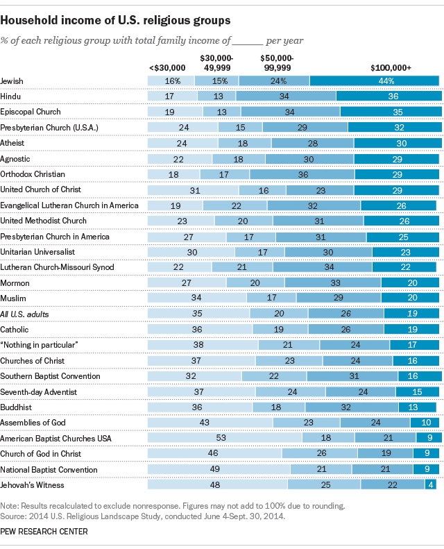
The graph is generated using 2014 data, and it reports patterns that have been in place for quite some time. Jewish and mainline Protestant denominations have the highest income profiles; they also have the highest education rates on average. Stricter churches tend to be closer to the bottom.

0 Comments